
From soothing teals to bold oranges, WSGN and COLORO’s forecasts promise a wardrobe full of optimism, nostalgia, and escapism.
Colour doesn’t just influence what we buy – it shapes how we feel. After years marked by pandemic uncertainty, global conflicts, and climate anxiety, colour has taken on a new role: an escape from reality. Bright, joyful shades are now a form of emotional self-care, reminiscent of India’s exuberant Holi festival.
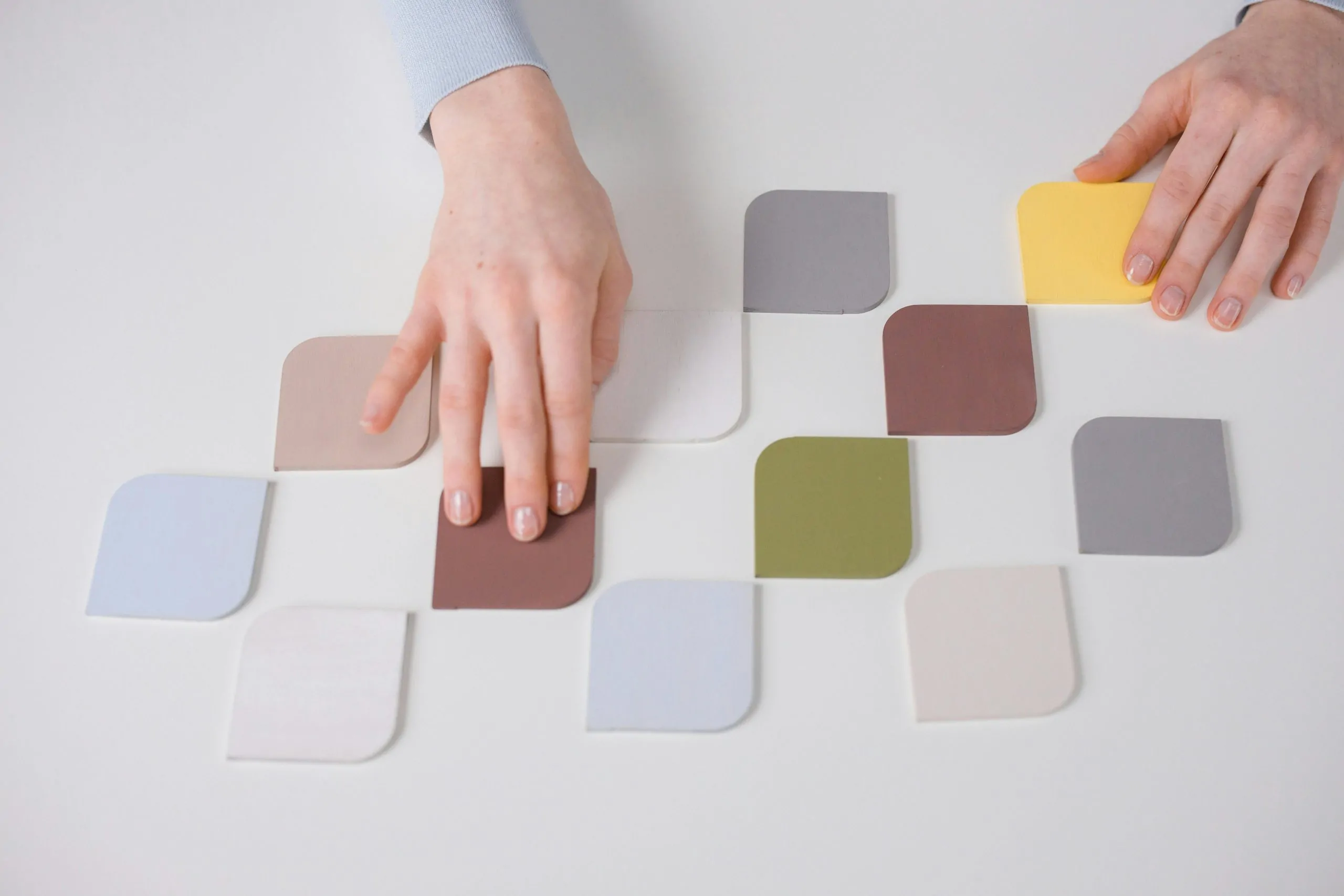
Trend forecasters WSGN and COLORO – leaders in consumer insight and colour innovation – have unveiled the palettes set to define 2026 and 2027. Here are the shades that will inspire wardrobes, moods, and lifestyles over the next two years.
Colour of the Year 2026: Transformative Teal
A fusion of dark blue and aquatic green, Transformative Teal symbolises change and redirection. It brings freshness, calm, and restoration. Pair it with grey, beige, or cream for a sophisticated look, or keep it tonal with other greens. Add gold or silver jewellery for a festive touch, and use Energy Orange accessories to make it pop.
Colour of the Year 2027: Luminous Blue
Dynamic, mysterious, and versatile, Luminous Blue works across everything from occasion wear to activewear. It harmonises with neutrals like beige and white, contrasts beautifully with soft purples or yellows, and balances earthy tones like terracotta or chocolate brown. Even WSGN’s trend shade Blue Aura – a pale blue-grey – pairs effortlessly with it.
Amber Haze
A warm, nostalgic yellow with a sophisticated glow, Amber Haze radiates comfort. It works well with rich browns like Pantone’s Mocha Mousse or bright shades such as Butter Yellow and Yellow Jasper. Pair it with green tones like Meadowland Green or accentuate with amber jewellery for a chic evening look.
Pop Pink
Romantic, nostalgic, and joyfully carefree, Pop Pink is the colour of celebration. From festive dinners to nightclubs, it brings fun and optimism. It’s feminine, playful, and effortlessly uplifting.
Meadowland Green
This mid-green hue evokes nature, nourishment, and tranquillity – a reminder of the world we long for. Perfect for monochrome styling, it shines when layered with other greens.
Clay
A pink-toned neutral with earthy warmth, Clay is versatile and resilient. Wear it in tonal outfits with cocoa browns, mix it with beige or white for subtlety, or contrast it with brighter shades like Luminous Blue or Butter Yellow for modern edge.
Energy Orange
Bolder than classic orange, Energy Orange makes a powerful statement. Best used in accessories or statement pieces, it pairs with red, cobalt blue, rose pink, or purple. According to WSGN, its vibrancy conveys security and protection.
Bringing It All Together
What makes the 2026/2027 palette remarkable is how easily these colours combine – whether soothing teals with grounding clays, or playful pinks with bold oranges. This “colour mania” is about joy, connection, and optimism in challenging times.
So, which of these forecast shades will find their way into your wardrobe? Will you embrace the calm of Transformative Teal, the boldness of Energy Orange, or the nostalgia of Pop Pink?
Tell us your favourite colour trend for 2026/2027 in the comments – we’d love to hear your thoughts!